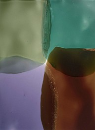
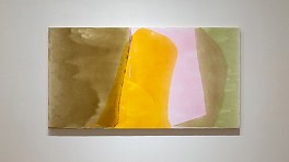
Artist's Choice: Interconnected
May 7 - June 7, 2020
View Exhibition
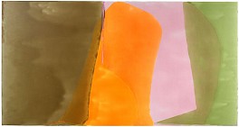
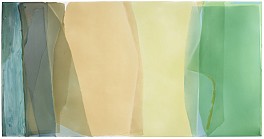
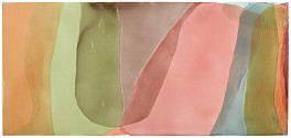
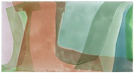
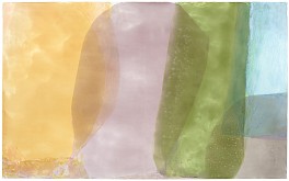
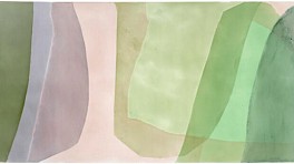
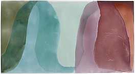
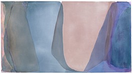
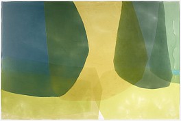
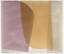
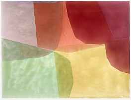
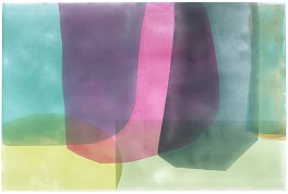
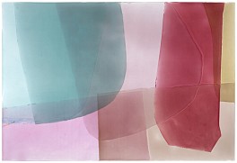
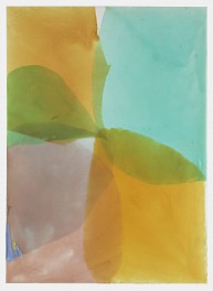
Berry Campbell is pleased to announce Artist’s Choice: Interconnected, an exclusive online exhibition of works from gallery’s inventory chosen by Berry Campbell’s represented contemporary artists. Eric Dever, Judith Godwin, Ken Greenleaf, Jill Nathanson, Ann Purcell, Mike Solomon, Susan Vecsey, James Walsh, Joyce Weinstein, and Frank Wimberley have thoughtfully selected one work from our gallery inventory that they associate with their own creative process and artistic journey. This artist-curated exhibition is an inquiry into the lines of influence and connections within our Berry Campbell artist community. Artist’s Choice: Interconnected launches digitally May 7, 2020.
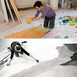
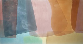
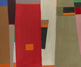
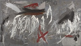
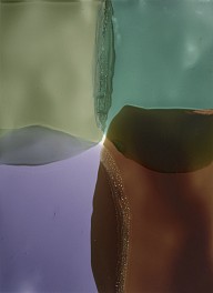
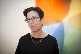
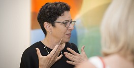
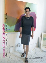
The choices are sometimes expected, and at other times, surprising. Some artists were inspired by a painting from an artist they had never met, and others paid tribute to old friends or mentors. Judith Godwin recalls good times with her old friend and art dealer, Betty Parsons. James Walsh remembers a painting by Walter Darby Bannard from a 1981 show at Knoedler Gallery. Mike Solomon pays homage to the perseverance of abstract painter and dear friend, Frank Wimberley saying: “The quiet intermingling of his experience, with the purity of painting, gives his abstractions an authenticity and delicacy that is profound to witness.” Ken Greenleaf favorite is Cloistered #5 (1968) by Ida Kohlmeyer, delighting in the pure abstraction. Jill Nathanson picked a color-field forerunner, Dan Christensen. Ann Purcell admitted to being picky but found true inspiration after visiting our Yvonne Thomas show repeatedly. Eric Dever ruminates about Charlotte Park: “Like a favorite poem, novel or even film, a painting can be a touchstone, something one returns to with certain regularity; perhaps a gauge of some kind, beginning with personal happiness on the occasion of discovery and new revelation as our lives unfold.” Joyce Weinstein finds parallels with John Opper. Susan Vecsey loves the “stillness and movement” of Elaine de Kooning’s Six Horses, Blue Wall (1987). No coincidence that Vecsey lives down the road from the Elaine de Kooning house in the Hamptons. Frank Wimberley recalls of Herman Cherry: “He was one of the East End artists who wished to me to succeed.”
ABOUT BERRY CAMPBELL
Christine Berry and Martha Campbell have many parallels in their backgrounds and interests. Both studied art history in college, began their careers in the museum world, and later worked together at a major gallery in midtown Manhattan. Most importantly, however, Berry and Campbell share a curatorial vision.
Both art dealers developed a strong emphasis on research and networking with artists and scholars during their art world years. They decided to work together, opening Berry Campbell Gallery in 2013 in the heart of New York's Chelsea art district, at 530 West 24th Street on the ground floor. In 2015, the gallery expanded, doubling its size with an additional 2,000 square feet of exhibition space.
Highlighting a selection of postwar and contemporary artists, the gallery fulfills an important gap in the art world, revealing a depth within American modernism that is just beginning to be understood, encompassing the many artists who were left behind due to race, gender, or geography-beyond such legendary figures as Pollock and de Kooning. Since its inception, the gallery has been especially instrumental in giving women artists long overdue consideration, an effort that museums have only just begun to take up, such as in the 2016 traveling exhibition, Women of Abstract Expressionism, curated by University of Denver professor Gwen F. Chanzit. This show featured work by Perle Fine and Judith Godwin, both represented by Berry Campbell, along with that of Helen Frankenthaler, Lee Krasner, and Joan Mitchell. In 2019, Berry Campbell's exhibition, Yvonne Thomas: Windows and Variations (Paintings 1963 - 1965) was reviewed by Roberta Smith for the New York Times, in which Smith wrote that Thomas, "... kept her hand in, adding a fresh directness of touch, and the results give her a place in the still-emerging saga of postwar American abstraction.”
In addition to Perle Fine and Judith Godwin, artists whose work is represented by the gallery include Edward Avedisian, Walter Darby Bannard, Stanley Boxer, Dan Christensen, Eric Dever, John Goodyear, Ken Greenleaf, Raymond Hendler, Ida Kohlmeyer, Jill Nathanson, John Opper, Stephen Pace, Charlotte Park, William Perehudoff, Ann Purcell, Mike Solomon, Syd Solomon, Albert Stadler, Yvonne Thomas, Susan Vecsey, James Walsh, Joyce Weinstein, Frank Wimberley, Larry Zox, and Edward Zutrau. The gallery has helped promote many of these artists' careers in museum shows including that of Bannard at the Institute of Contemporary Art, Miami (2018-19); Syd Solomon, in a traveling museum show which culminates at the John and Mable Ringling Museum in Sarasota and has been extended through 2021; Stephen Pace at The McCutchan Art Center/Pace Galleries at the University of Southern Indiana (2018) and at the Provincetown Art Association and Museum (2019); and Vecsey and Mike Solomon at the Greenville County Museum of Art, South Carolina (2017 and 2019, respectively); and Eric Dever at the Suffolk Community College, Riverhead, New York (2020). In an April 3, 2020 New York Times review of Berry Campbell's exhibition of Ida Kohlmeyer's Cloistered paintings, Roberta Smith stated: “These paintings stunningly sum up a moment when Minimalism was giving way to or being complicated by something more emotionally challenging and implicitly feminine and feminist. They could hang in any museum.”
Collaboration is an important aspect of the gallery. With the widened inquiries and understandings that have resulted from their ongoing discussions about the art world canon, the dealers feel a continual sense of excitement in the discoveries of artists and research still to be made.
Berry Campbell is located in the heart of the Chelsea Arts District at 530 West 24th Street, Ground Floor, New York, NY 10011. For further information, contact us at 212.924.2178, info@berrycampbell.com or www.berrycampbell.com.
Read More >>