Jill Nathanson

Jill Nathanson News: PANEL DISCUSSION | "Painters Talking: What We Talk About When We Talk About Abstraction", December 12, 2023

PANEL DISCUSSION | "Painters Talking: What We Talk About When We Talk About Abstraction"

December 12, 2023

Tuesday, Dec. 19, 2023 at 6:00pm 

Hosted by the Art Students League of New York

Phyllis Harriman Mason Gallery, 2nd Fl 215 W 57th Street, New York

This panel discussion will bring together artists who have both studio and pedagogical practices to discuss abstraction and its teaching today. Participants include League instructors Jill Nathanson and James Little, as well as Carl E. Hazlewood, Harriet Korman, and John Mendelsohn. Moderated by Mario Naves.

Event tickets: https://www.eventbrite.com/e/painters-talking-what-we-talk-about-when-we-talk-about-abstraction-tickets-754042339937?aff=oddtdtcreator 

Read More >>

Jill Nathanson featured in The Art Students League Instructor Salon 2023 - On View through October 1

September 21, 2023


Jill Nathanson's work will be featured in the Art Students League Instructor Salon 2023 at the Phyllis Harriman Mason Gallery & AFAS Lobby Gallery - 215 W 57th Street, New York, NY 10019
Read More >>
Jill Nathanson News: 'Women Choose Women' Exhibition at The Barn Celebrates Unstoppable Girl Power, August  2, 2023 - Rachel Feinblatt for Hamptons Magazine

'Women Choose Women' Exhibition at The Barn Celebrates Unstoppable Girl Power

August 2, 2023 - Rachel Feinblatt for Hamptons Magazine


Proving that no force is stronger than girl power, Frampton Co and Berry Campbell present Women Choose Women at Exhibition The Barn.

Read More >>
Jill Nathanson News: ON VIEW | Jill Nathanson, "Breath Woven 5" and "Breath Woven II" at Museum of Fine Arts, Houston, August 30, 2022 - Museum of Fine Arts, Houston

ON VIEW | Jill Nathanson, "Breath Woven 5" and "Breath Woven II" at Museum of Fine Arts, Houston

August 30, 2022 - Museum of Fine Arts, Houston

The third installation of the Prints & Drawings gallery in the Nancy and Rich Kinder building opened to the public on January 7, 2022. This gallery highlights modern and contemporary works from the Prints & Drawings collection.

The Nancy and Rich Kinder Building is dedicated to the Museum’s international collections of modern and contemporary art. The soaring spaces feature displays that span media encompassing painting and sculpture, craft and design, video, and immersive installations. The wide-ranging collection of Prints & Drawings are on view in gallery 207, split into four sections. Objects in the first section, “After Dark: Night at the Turn of the Century,” show artists’ responses to the aesthetic possibilities and shifting cultural connotations of night; those in the second, “Drawn to Color,” represent works on paper by Color Field artists and others who explore the expressive potential of color. The last two sections include “Meticulous,” which highlights works featuring repetitive, accumulative mark-making, and “Celebrating Tamarind Institute at 62,” and installation of lithographs produced by women artists at this important workshop from the 1960s to today.

The second section showcases works on paper by twentieth-century Color Field artists, as well as contemporary artists influenced by the movement’s embrace of pure color as a vehicle for expression. Using a diverse array of media, including oil, acrylic, watercolor, ink, and pastel, the artists in “Drawn to Color” produce abstract compositions that engage in varied ways with color’s evocative potential. Works by seminal figures such as Mark Rothko, Sam Francis, and Helen Frankenthaler hang alongside ones by living artists like Terrell James and Emmi Whitehorse, illustrating the continuing legacy of the Color Field movement and expanding the scope of its canon.

Read More >>
Jill Nathanson News: ON VIEW: Jill Nathanson at the Museum of Fine Arts, Houston, July 20, 2022 - Museum of Fine Arts, Houston

ON VIEW: Jill Nathanson at the Museum of Fine Arts, Houston

July 20, 2022 - Museum of Fine Arts, Houston


Jill Nathanson
Breath Woven 11, 2019
Acrylic and polymers on Yupo paper
24 12 x 18 inches
Collection of Museum of Fine Arts, Houston

View Works by Jill Nathanson

Read More >>
Jill Nathanson News: The Hopkins Review Presents: A Conversation with Jill Nathanson, May  7, 2022 - Thu Nhat Pham for The Hopkins Review

The Hopkins Review Presents: A Conversation with Jill Nathanson

May 7, 2022 - Thu Nhat Pham for The Hopkins Review

Jill Nathanson in conversation with Thu Nhat Pham, THR Editorial Assistant


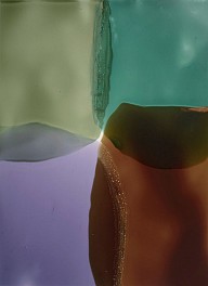
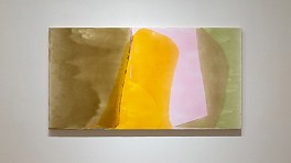
Jill Nathanson, Light Wrestle, 2020, 45 1/2 x 95 1/2 inches. Private Collection.

How did the paintings [in the folio] come to be?

It’s hard to know where to start. I think abstract painting, for any serious painter, is a manifestation of a whole understanding of what painting is about and what abstract painting might do. The paintings manifest something about painting and about abstract painting: I’ll leave that to the side.

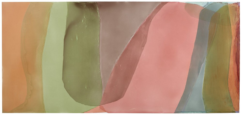
I’ll say that the paintings in the folio are painted with thick poured acrylic polymer paints, and they’re very transparent. All the paint is absolutely transparent, and it’s poured onto a wood panel that’s been prepared and painted white so that the light reflects off of it. This is a very unforgiving process: pouring thick plastic onto wood and letting it dry and then pouring more thick transparent plastic on top of it. There’s no room for a mistakes or corrections really.

And so, I worked from studies. I worked from transparent plastic studies, which take me a very long time to create. So, a lot of the creative process goes on a small scale and the paintings are enlarged versions of these color studies. There are certain things that I want each color study to accomplish visually, and I want that visual experience to call forth all kinds of other intellectual, emotional, spiritual kinds of responses. But it all really starts with a small six by nine inch plastic study.

Really, it also goes back to discoveries that I made when I was an undergraduate at Bennington College. I discovered what was then a really important art movement: Color Field painting. I fell in love with it, and I was encouraged to be experimental. I experimented with acrylic paint and discovered that I just loved thick transparent color and that working with thick transparent colors, sometimes in relationship to opaque color, I felt that I could make discoveries that I hadn’t seen anybody else work with.

A lot of my life as a painter, over almost 50 years, has been about pure color relationships, color in fields, transparency, and materiality.

So that’s sort of an intro to how things get going.

What are the oppositions that you try to balance in your painting process?

What are the oppositions that I try to balance in my painting process? You initially asked me if there were three words that I could choose to describe my painting process and my approach to painting. I kind of bristled or pulled back from that because I don’t think that there are descriptive words that I’d like to use. I feel like there are challenges or oppositions that my painting is involved with and that my whole painting life has been involved with trying to engage.

One of them would be “Shape Versus Field.” This probably sounds very meaningless and like “what’s the difference between shape and field?” But, in fact, it has a very important position in the history of abstraction and particularly abstraction over the last, say 50 years. At a certain point in high modernism in America there was a quality of field in painting that was very important, I would say, from Mark Rothko, Barnett Newman, Jackson Pollock. And then into the pure color painting of color field painters, there was a sense of the painting as being kind of a field of energy or maybe opposing energies or moving energies. But it was kind of anti-shape. It was polyphonic painting where every part of the surface was equally important. It became kind of allover painting (that’s one way to talk about it). But I would say painting as a field that transmits a kind of energy was very important in high modernism.

Then that really fell out of fashion.

Now, some of my favorite painters, let’s say Amy Sillman who is a very wonderful contemporary painter, are very focused on shape and discovering new ways of thinking about shape: shape that’s flat, shape that kind of pushes and pulls in space, etcetera. There’s kind of been a re-emergence of a focus on shape. And I love a lot of that painting. It’s so exciting to me. I think it’s a wonderful moment in abstract painting. There are so many people I could mention who were involved with creating a new feeling of shape, kind of funky, a little bit troubling, a little bit awkward, kind of anti-heroic. I love this painting, but I would say that for me: I’m involved with kind of negotiating that opposition between field and shape and not having one take over from the other. So, “Field and Shape,” and when I say “Field,” I mean color as an energy field, and how do you have an energy field that also has a shape. They don’t really work together, but that’s kind of the ambition and the process and the way of thinking or hoping or approaching a painting or the story I tell myself about what I’m doing. Whether it’s overstated or not, that’s how I talk about it to myself.

Another one is “Color as light / color as matter.” Paint color has two realities. It’s gloppy, expensive stuff you get in jars or tubes or whatever. You mix it and it’s totally material. It’s glop but it’s also light. You put colors together, they vibrate, and you have a quality of light that you can create in a painting. The opposition between those two things, I think, is so key to the magic of painting throughout history and really is a focus of abstract painting. How do you find your way to really give that experience of the material of paint, simultaneously the light quality of paint, and simultaneously the object of a painting, which is a big, heavy thing that’s stuck on a wall. It costs money and takes up space, and it’s very, very material, and how do you have it feel like it is this transcendent light kind of a thing at the same time as you’re not making an illusion? So, that material light thing is a big biggie for me.

A third opposition that I was thinking about: a range of abstract painting as an image because everything, every painting, has an image, and abstract painting as a process of looking, a kind of meditation. I think every painting that’s worth its salt is both: there’s an image that you look at (“Oh yeah! I see that image, I like that image!”), but it’s also a process that engages you in putting it together, as in time with your optical nerves or muscles or whatever works in your eyes, which I don’t really know that much about. It’s a process and it’s also an image.

So those are the things: “Shape versus Field,” “Color in paint versus Material in paint,” and “Image versus Process.” They’re all kind of interrelated, but I think it’s worth it to kind of tease them out.

Read More >>
Jill Nathanson News: Jill Nathanson , April 25, 2022 - Karen Wilkin for The Hopkins Review

Jill Nathanson

April 25, 2022 - Karen Wilkin for The Hopkins Review

Karen Wilkin for The Hopkins Review, Winter 2022
Read More >>
Jill Nathanson News: Nathanson, Wilkin to deliver Sheldon’s Oct. 26 ‘CollectionTalk’, October 23, 2021 - Nebraska Today

Nathanson, Wilkin to deliver Sheldon’s Oct. 26 ‘CollectionTalk’

October 23, 2021 - Nebraska Today

Sheldon Museum of Art will a conversation with artist Jill Nathanson and curator and critic Karen Wilkin on Oct. 26 at 5:30 p.m. via on Zoom. Nathanson’s painting “Cantabile” is a new acquisition on view at Sheldon in the exhibition, “Point of Departure: Abstraction 1958–Present.”

Registration is required for the free event.

Nathanson completed her undergraduate studies at Bennington College in Vermont, where she worked in the artistic orbit once occupied by Helen Frankenthaler. Although both artists are known for reducing painting to its physical essence, Nathanson’s immersive and sensual paintings stand in a category of their own. Consisting of unusual hues of overlapping layers of variable translucency, they create emotionally nuanced experiences with yet enough tension to engage the viewer’s contemplation. Her most recent solo show was “Jill Nathanson: Light Phrase” at Berry Campbell Gallery, New York, in January 2021.

Wilkin is a New York-based curator and critic. Educated at Barnard College and Columbia University, she is the author of monographs on Stuart Davis, David Smith, Anthony Caro, Isaac Witkin, Kenneth Noland, Helen Frankenthaler, Giorgio Morandi, Georges Braque, Wayne Thiebaud and Hans Hofmann, and has organized international exhibitions of their work. She was a juror for the American Pavilion of the 2009 Venice Biennale and a contributing editor of the Stuart Davis and Hans Hofmann paintings catalogues raisonné. The contributing editor for art for the Hudson Review and a regular contributor to The New Criterion, Hopkins Review, and the Wall Street Journal, Wilkin teaches in the New York Studio School’s MFA program.

This online event is part of the museum’s CollectionTalk series, which features live discussions about artwork and exhibitions with artists, curators, and historians. On Nov. 11, the series continues with artist Odili Donald Odita in conversation with Tyler Green, host of the Modern Art Notes Podcast. For more information on Sheldon Museum of Art and its programming, visit its website.

Read More >>