Herman Cherry, Blue Painting | SOLD, 1956
Oil on canvas, 11 x 29 in.
Frank Wimberley on Herman Cherry:
This is an artist I met back in the ‘80s whose color sense easily caught my eye and quickly became one of my favorite painters not only because of his ease at putting his compositions together, but also doing so with an originality which was his own. I had a great opportunity to chat with him and Kenneth Noland and Kenneth's brother, Neil, in the corner of a small after-party when Herman was featured in a fantastic show at Staller Gallery in Stony Brook. I only wish that I had gotten to know his great sense of humor and his willingness to share painting tips sooner. He was one of the East End artists who wished to me to succeed.
Frank Wimberley (b. 1926)
Over the course of a career that has lasted more than fifty years, Frank Wimberley has felt abstract painting to be a continuous adventure. The artist is a well-known presence in the art scene on the East End of Long Island and an important figure in African-American art since the 1960s. Acclaimed for his dynamic, multi-layered, and sophisticated paintings, Wimberley is among the leading contemporary artists to continue in the Abstract Expressionist tradition. What has always excited him is to take the theme or feeling from the very first stroke he lays down and follow it to its particular conclusion, “very much like creating the controlled accident.” His improvisational method is akin to jazz, an important part of his life and a theme in his art. Despite the spogntaneity of his process, Wimberley makes each decision deliberately, respectful of what emerges and where it is going; he enjoys the surprise of arriving at definitions that seem to come to life on their own. Similarly, his works engage the viewer in their strong physicality and unpredictability as well as in their insights into the ways that pictorial experiences are perceived and understood. Read Full Biography
Charlotte Park, Untitled | SOLD, c. 1963
Oil on canvas, 50 x 50 in.
Eric Dever on Charlotte Park:
Like a favorite poem, novel or even film, a painting can be a touchstone, something one returns to with certain regularity; perhaps a gauge of some kind, beginning with personal happiness on the occasion of discovery and new revelation as our lives unfold. Charlotte Park’s painting, Untitled, c. 1963, oil on canvas, 50 x 50 inches is this for me.
I was born on the opposite coast a year after the painting was completed—fast forward another 40 years, having found a postcard reproduction of this painting in an East End art gallery upon moving to the area myself. The image captured my full attention, despite its small scale. The palette resonated instantly, the warm yellow underpainting with cool blues moving towards lavender and magenta. Orange shapes alternate deftly between foreground and background, as white brushstrokes hover lightly, offering similarly another example of the push and pull, one of the hallmarks of Abstract Expressionism. I didn’t know anything about Charlotte Park, but it seemed to me a perfect painting and a postcard I would keep forever.
Learning more about Park, her years spent working through a black and white palette, as de Kooning, Pollock and Kline, I especially admire her paint handling, and use of palette knives and brush. Her self-identification with the natural world is apparent. It would take me the better part of a decade to glean some of her references. Although one could never know for certain, her titles give nothing away. I imagine some of the bay views and ocean cliffs seared into her optic memory, though her paintings will always know more than we do.
Eric Dever (b. 1962)
Over the last decade, Eric Dever has pursued intensely focused investigations into methods and materials, creating works which gradually have evolved into sensitively executed and intimate works of art. Dever was born in Los Angeles, California and received his Bachelors degree from California Lutheran University, Thousand Oaks. He moved to the East Coast to study at New York University where he received his Master of Arts.
For more than a decade, Eric Dever purposefully redacted color, using a limited palette: white for four years, white and black for two years, followed by white, black and red. “I found myself taking cues from flowers as they blossomed and color entered my paintings.” However, instead of exploring just one color at a time, Dever embraced the entire spectrum. Initially he used mostly mixed tints, but with this epiphany of color, he began creating new mixed hues. Read Full Biography
Yvonne Thomas, Untitled, c. 1963
Oil on canvas, 15 5/8 x 17 1/4 in.
Ann Purcell on Yvonne Thomas, Untitled, c. 1963:
I was excited to discover this Yvonne Thomas painting. Through rigorous tutorials in connoisseurship from two artist mentors I came to be very picky about quality. I went to see the exhibit several times and still was sad to see it go. That emotional bond with someone's painting is so rare to find today. She has a deft touch, is intelligently consistent, and is a great colorist. The way she bends the colors so deceivingly minimal is true virtuoso. There is a Rothko-like meditativeness to this work. Lushness of colors, layers of textures, sensitive markings - I could look at this painting all day! It takes one to a beautiful place.
Ann Purcell (b. 1941)
For Ann Purcell, a nationally recognized artist, whose abstract work is represented in museums across the United States, process is a critical factor. The gestural and alive qualities of her paintings, collages, and works on paper reflect her use of process as a means of expression and exploration, as she works within tensions of paradox, ambiguity, duality, and contradiction. Her method is related to dance—an important form for her beginning in her childhood—as well as to music, while she draws on her thorough grounding in European and American Expressionist traditions. The breadth of art history is also an important source for Purcell; she states that “one of the things that is so wonderful about art is that art history is an endless resource—one cannot consume it all. There are thousands of years of art to mine and find a challenging and supportive foundation for the artist.” In the catalogue for a solo exhibition of Purcell’s work at the Corcoran Gallery, Washington, D.C. (1976), the museum’s chief curator Jane Livingston noted Purcell’s “fluidity with a vast range of idioms.” Livingston wrote: “Purcell is among the most disciplined and prolific artists I have encountered: the number of fresh, sometimes startlingly brutal, sometimes exquisitely refined works she manages to create in the continually ongoing process of her production is proportionately remarkable.” Read Full Biography
Ida Kohlmeyer, Cloistered #5, 1968
Mixed media on canvas, 68 x 71 in.
Ken Greenleaf on Ida Kohlmeyer, Cloistered #5, 1968:
The suggestion was to pick a work from the inventory, which turned into a long ramble through the work so many good painters - Darby Bannard’s inventive knowledge, Dan Christensen’s pure talent, Stanley Boxer’s surface and Joyce Weinstein’s deliberating marks. So many. But I settled on Ida Kohlmeyer’s Cloistered #5. It is what it is, almost completely abstract and un-referential. It has a solid presence that declares its own existence, and I’ve come to value that.
Ken Greenleaf (b. 1945)
An artist whose work is embedded in a philosophical and theoretical framework, Ken Greenleaf is a committed modernist, working in the minimalist tradition. In recent years, his emphasis has been on creating streamlined paintings on shaped supports and paper collages, in which he continues the engagement with relations between shapes and materials that has been the central focus of his art. While comprised of geometric forms, Greenleaf’s art has a freeform aspect, forcing us to mentally organize what we’re seeing into “ideas.” He perceives the edges of his shaped surfaces, the color of his raw canvases, and the borders of his painted areas as “direct essays in understanding how we apprehend what we see and how we recognize what is real.” The tension between flatness and the feeling of and desire for illusion in Greenleaf’s art brings us to a place between raw sensation and the conceptual, which is ultimately a metaphysical one. Greenleaf, whose art has been shown widely at galleries and museums since the early 1970s, is represented by Berry Campbell Gallery, New York. Read Full Biography
Ken Greenleaf on Ida Kohlmeyer, Cloistered #5, 1968:
The suggestion was to pick a work from the inventory, which turned into a long ramble through the work so many good painters - Darby Bannard’s inventive knowledge, Dan Christensen’s pure talent, Stanley Boxer’s surface and Joyce Weinstein’s deliberating marks. So many. But I settled on Ida Kohlmeyer’s Cloistered #5. It is what it is, almost completely abstract and un-referential. It has a solid presence that declares its own existence, and I’ve come to value that.
Dan Christensen, Pollux, 1968
Acrylic on canvas, 102 x 74 in.
Jill Nathanson on Dan Christensen:
Coming to artistic maturity immersed in Color Field painting, I ardently distinguished between the most pure, exemplary works and others that were merely beautiful or "good painting." I had not thought of Christensen as painting the most defining works (of what I felt to be a visionary art of painting with light) but Berry Campbell’s exhibition of Early Sprays in 2019 belatedly corrected me.
Jill Nathanson
In her reduction of painting to its physical essence, Jill Nathanson belongs to the Color Field legacy, but her immersive and sensual paintings stand in a category of their own. Consisting of unusual hues of overlapping layers of variable translucency, they create emotionally nuanced experiences with yet enough tension to engage our contemplation. Empirical Empyrean, the title of one of her paintings her second exhibition at Berry Campbell, suggests the fine line on which her work rests. Read Full Biography
Betty Parsons, The Moth, 1969
Oil on canvas, 68 1/2 x 74 in.
Judith Godwin on Betty Parsons:
Kenzo Okada introduced me to Betty Parsons, and I had my first show on 57th street with Betty. She was a wonderful friend. Kenzo, Betty, and I would go on picnics together out on Long Island. Betty was an art dealer, but a marvelous painter too.
Judith Godwin (b. 1930)
For Judith Godwin, painting “is an act of freedom and a realization that images generated by the female experience can be a powerful and creative expression for all humanity.” From 1950, when she first exhibited her work, to the present, Godwin has held to her convictions, using a language of abstract form to respond with unbowed directness and passion to life and nature. Her aim throughout her career has been to “emphasize what is important by painting the image of my feelings on canvas—to accept my feelings honestly, and not [to] falsify.” Through her studies with Hans Hofmann, her long association with Martha Graham and Graham’s expressive dance movements, her participation in the early burgeoning of Abstract Expressionism, and her love for Zen Buddhism and gardening, Godwin has forged a personal and unique career path. Read Full Biography
John Opper, Untitled, 1969
Acrylic on canvas, 54 x 72 in.
Joyce Weinstein on John Opper:
I especially liked this painting of John Opper, Untitled, acrylic on canvas, 54 x 72 inches with a large red form. I like John Opper’s work, but I especially liked this painting. It looks like “it should not work,” but is a beautiful painting-the color-shapes-everything!
Joyce Weinstein (b. 1931)
An artist who has received critical acclaim nationally and internationally since the early 1950s, Weinstein is distinguished by her dual commitment to the trajectories of abstraction and plein-air painting. The works on view, inspired by her surroundings in rural Columbia County, New York, demonstrate this convergence. Rendered in oil, washes, impasto, and contrasts of hue and texture, the works represent what Weinstein describes as “another kind of landscape painting, more ‘real’ than literal interpretations.” Read Full Biography
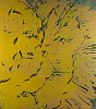
Walter Darby Bannard, Cloud Comb, 1981
Acrylic on canvas, 74 1/2 x 66 in.
James Walsh on Walter Darby Bannard:
Darby Bannard's Cloud Comb, 1981 was painted at the culmination of a ten-year run of works in which he was combining a surface contrast of thickened acrylic gel drawing and poured liquid acrylic. Cloud Comb was cropped out of a large sheet of canvas roughly ten by twenty feet that was affixed to a dead level horizontal painting dock. Several other paintings were cropped out of the same sheet and stretched. The billowing vector of Cloud Comb's drawing presage the next phase of Bannard's 'scallop' paintings. I remember seeing Cloud Comb in Darby's May 1981 show — just about forty years ago to the day — it was a knockout then and gets better every time I've been able to see it. There is a 'bannardesque' dynamic between the implied expansiveness of the drawing and the cool and full resonance of the painting. This is a 'power' painting — you just want to keep looking at it.
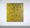
James Walsh (b. 1954)
Jim's style is something more like an anti-style. A Walsh is recognizable by its dramatic paint effects, usually with one or two veritable tidal waves of acrylic paint on an otherwise placid ocean of color. But formal commonalities end there. The only rule in play is continual reinvention from work to work. This means that color can vary widely, from acidic primaries to foggy neutrals. The applications range from gigantic brushwork to fluid pours. Surface effects include deliberate application of flat color next to mysterious laminations formed by transparent acrylic bases flecked with liquid paint.
It's a truism that reproduction doesn't do justice to good painting, but it's especially apt in Jim's case, as his canvases sometimes have crests of paint several inches thick adorning areas that have been stained, glazed, or scraped down to the cotton. Though hung on the wall and meant to be viewed from the front, many of them have a depth of six or eight inches. Crucial, though, is that Jim is employing the entire depth. Read Full Biography
Elaine de Kooning, Six Horses: Blue Wall | SOLD, 1987
Acrylic on canvas, 46 x 60 in.
Susan Vecsey on Elaine de Kooning:
I love how this painting reveals itself more and more as you spend time with it. There are images within images, stillness and movement. And the image is so contained, horses and fragments of horses pushing against the edges of the painting.
Susan Vecsey (b. 1971)
Susan Vecsey was born in New Jersey and currently lives and works in both New York City and East Hampton, New York. She earned her Bachelor of Arts from Barnard College, Columbia University, New York and her Master of Fine Arts from the New York Studio School of Drawing, Painting and Sculpture, studying under Graham Nickson. In 2012, Vecsey was a visiting artist at the American Academy in Rome.
Vecsey had a solo museum exhibition at the Greenville County Museum, South Carolina, in 2017 that was accompanied by an exhibition catalogue with an essay by Phyllis Tuchman. “Unlike, say, Fairfield Porter, another East End artist, Vecsey is less involved with the here and now. She’s not recording the details of daily life. She’s reminding you of places where you have been. With swooping curves, extended horizon lines, and a mix of tonal colors, Vecsey’s compelling images have the character of memories, recollections, reveries. You’re revisiting sites of pleasure and wonderment.” Read Full Biography
Frank Wimberley, Scarlet Junction, 2010
Acrylic on canvas, 56 x 56 in.
Mike Solomon on Frank Wimberley:
Frank Wimberley's work has always stopped me in my tracks. It's so playful and inventive with color and texture, gesture and composition. Yet there's a pathos in the work. The quiet intermingling of his experience, with the purity of painting, gives his abstractions an authenticity and delicacy that is profound to witness.
Mike Solomon (b. 1956)
Mike Solomon has exhibited widely throughout the United States at museums, galleries, and art fairs. In recent years, Solomon was included in the important exhibition, “Art of Our Time” curated by Matthew McLendon at the John and Mable Ringling Museum of Art, Sarasota, Florida and “Defining Abstraction” curated by Mark Ormond at the Ringling College of Art and Design and had a solo installation exhibition at the Greenville County Museum, South Carolina in February, 2019. Read Full Biography