-

At Art Basel Hong Kong, More Collectors Are Buying With Purpose
Observer March 26, 2026 Berry Campbell attracted plenty of attention with its presentation of long-overlooked American abstraction, particularly by women artists. “We’ve witnessed an... Read more -
Art Basel Hong Kong 2026: VIP Days Signal Recovery
Artlyst March 25, 2026 The doors opened, and the money moved. That’s the short version of VIP Day One at Art Basel Hong Kong... Read more -
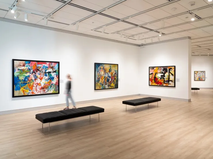
The 10 Best Booths at Art Basel Hong Kong 2026
Artsy March 25, 2026 BERRY CAMPBELL Booth 3E06 With works by Alice Baber, Janice Biala, Bernice Bing, Louisa Chase, Elaine de Kooning, Lynne Drexler,... Read more -
Celebrating Women Abstract Artists Across America In Women’s History Month
Forbes March 20, 2026 This month, throughout the spring, and continuing all year at museums across America, great women abstract artists of today, and... Read more


-
Nanette Carter | The Pratt Alumni Achievement Award
Pratt March 13, 2026 The Pratt Office of Alumni Engagement 2026 Alumni Achievement Awards luncheon. The Alumni Achievement Awards recognize outstanding alumni who have... Read more -
Dorothy Dehner On View | All Growing Things
Tang Museum | Skidmore College March 4, 2026 All These Growing Things Aug 23, 2025 - Jul 19, 2026 All These Growing Things presents contemporary and historical paintings,... Read more -
Nanette Carter Awarded Grant for the Visual Arts
Foundation for Contemporary Artists February 23, 2026 The Foundation for Contemporary Arts (FCA) announced today the twenty-four artists who will receive its $45,000 Grants to Artists awards—the... Read more -
The Women of Abstract Expressionism Reclaim the Spotlight in a Blockbuster Show
Artnet News February 20, 2026 In 2024, art collector Christian Levett opened Europe’s first museum dedicated to women artists in a little town in the... Read more


-
Art Basel reveals exhibitors for Swiss fair’s 2026 edition
The Arts Newspaper February 19, 2026 Nearly 300 galleries will take part in this year’s edition of Art Basel, when the fair returns to the Swiss... Read more -
Art Basel unveils leading galleries and first highlights for its 2026 flagship show in Basel
Art Basel February 19, 2026 Art Basel is pleased to unveil the 290 participating galleries – including 21 new joiners – and first highlights of... Read more -
Ibram Lassaw at Berry Campbell Gallery
Sculpture Forum February 18, 2026 Ibram Lassaw: From Equinox to Solstice Berry Campbell Gallery, NYC. Discussion participants: sculptors Garth Evans and Jock Ireland, with guest... Read more -
Arts Intel Report | Judith Godwin
Air Mail February 14, 2026 Judith Godwin was a leading figure of the New York School, yet her art did not receive the attention given... Read more


-
James Walsh: Relief in Sight
ArtSeen | Brooklyn Rail February 1, 2026 Over the past several months in New York City, I’ve encountered paintings containing neon lights and umbrella spokes, paintings with... Read more -
Phillips Collection’s upcoming Miró exhibit celebrates the power of international exchange
Washington Business Journal January 29, 2026 The Phillips Collection, one of the District’s premiere modern art museums, is joining forces this spring with an esteemed European... Read more -
Two exhibits trace the origins of the Sarasota Artist Colony
Your Observer January 28, 2026 After World War II, veterans flocked to Sarasota and formed a tight-knit community of creators. Two exhibitions are now open... Read more -
Postcards from the Edge 2026
Visual Aids January 23, 2026 Online Sale Opens Saturday Jan 24, 2026 at 10am EST on this website View available work and pick-up artwork Berry... Read more


-
A Chelsea Chronicle: Larissa de Souza, Nicolas Party, Billy Childish and William Perehudoff
Wall Street Journal January 9, 2026 A visit to the New York neighborhood reveals the highs and lows of the art world at a quiet time... Read more -
Desmond-Fish Makes Room for New Faces
The Highlands Current January 9, 2026 Last year, after members of the project saw an exhibit curated by an upstate artist known as ransome at SUNY... Read more -
A New York City Apartment So Nice Neal Beckstedt Designed It Twice
Architectural Digest January 8, 2026 A monochromatic canvas by Larry Zox creates an eye-catching focal point in the primary bedroom, where a custom leather-and-oak bed... Read more -
Syracuse University Art Museum Broadens Collection With 2025 Acquisitions
Syracuse University January 8, 2026 The acquisitions reflect the museum’s ongoing commitments to centering diverse contemporary voices and deepening areas of collection strength. The Syracuse... Read more


-
Creating a Legacy with Love: Phong Bui’s Tribute to Meyer Schapiro
Observer January 2, 2026 A resonant exhibit at Vermont's Brattleboro Museum brings together work by artists who have endured displacement in search of freedom.... Read more -
The Flamboyance and Pizzazz of Miami Art Week 2025
Whitehot Magazine December 15, 2025 Art Basel Miami Art Basel Miami , as one would expect, was a total riot. No matter where you turned,... Read more -
Booming stock market is fueling a mega-billion return to classic art and a backlash to junk
New York Post December 14, 2025 Still, collectors who flew from far corners of the globe to Miami for Basel said they were seeing great success,... Read more -
Memorial Service | Frank Wimberley
Berry Campbell December 13, 2025 Memorial Service Frank Wimberley (1926-2025) Saturday, December 13, 2025, 1 pm Berry Campbell 524 W 26th Street, New York RSVP... Read more


-
Lassaw: The Projection Paintings Performance
Norte Maar in collaboration with the Estate of Ibram Lassaw and the Berry Campbell December 11, 2025 Lassaw: The Projection Paintings Performance a collaborative performance of the late 1940s glass slide projections of Ibram Lassaw performed by... Read more -
The Best New York City Exhibitions of 2025
Hyperallergic December 8, 2025 It's been a big year in New York City — and not just because we (thankfully) got a new mayor.... Read more -
In pictures: a sculptural celebration at Art Basel Miami Beach
The Art Newspaper December 6, 2025 Nora Lawrence, the executive director of Storm King Art Center in New York’s Hudson Valley, shares her favorite sculptures from... Read more -
Don’t Look for This Dealer Duo on the Social Circuit. They’re Busy Creating Markets for Overlooked Female Artists.
Cultured December 2, 2025 Armed with art history degrees, no small dose of resolve, and each other, Christine Berry and Martha Campbell are ensuring... Read more


-
AFA Honors Three Champions of the Art World
Hudson Valley Press November 30, 2025 The American Federation of Arts (AFA), the leader in traveling exhibitions worldwide since its founding in 1909, presented the 2025... Read more -
The Director of Art Basel Miami Beach, Bridget Finn, On This Year’s Fair
Surface November 25, 2025 Finn says that the galleries remain the heart of the fair. “In the main sector we see strong modern-art presentations—for... Read more -
Eric Dever | Real, Surreal, and Photoreal
Nassau County Museum of Art November 22, 2025 Real, Surreal, and Photoreal November 22, 2025 – March 8, 2026 NCMA invites visitors into a world where reality is... Read more -
Ida Kohlmeyer | Invocations: Selections from the Permanent Collection
Masur Museum November 20, 2025 Invocations: Selections from the Permanent Collection November 20, 2025 - February 6, 2026 Curated from our permanent collection, Invocations is... Read more


-
Mary Henry: A Long Unbroken Line
Portland Art Museum November 20, 2025 ON VIEW: Portland Art Museum 1219 SW Park Ave, Portland, Oregon November 20, 2025 - November 20, 2026 Mary Henry... Read more -
Beverly McIver announced as At-large Member of the North Carolina Arts Council November 19, 2025 Governor Josh Stein announced appointments to boards and commissions. Governor Stein has appointed the following to the North Carolina Arts... Read more
-
Christine Berry, Martha Campbell attend American Federation of the Arts Gala & Leadership Awards, 2025 November 17, 2025 Read more
-
Observer Art Power Index 2025
Christine Berry & Martha Campbell November 12, 2025 Martha Campbell and Christine Berry, have been selected for Observer's 2025 Art Power Index, recognizing the most influential figures driving... Read more


-
WOMEN COLLECTING WOMEN
Panel Discussion November 12, 2025 Please join Berry Campbell, The National Museum of Women in the Arts, and Less Than Half for a panel discussion... Read more -
How Do You Paint Opera Music? A New Show Reveals Lynne Drexler’s Novel Approach
Artnet news October 22, 2025 Berry Campbell presents 'Lynne Drexler: A Painted Aria,' homing in on the artist's practice during the 1970s. Beginning in the... Read more -
The Church as Campus for Artists
The East Hampton Star October 18, 2025 “Here and There: The First Churchennial,” the multimedia exhibition now on view at the Sag Harbor arts center, represents one... Read more -
The 10 Best Booths at Frieze London and Frieze Masters 2025
Artsy October 16, 2025 Dedicated to overlooked artists from the 20th century, the Spotlight section of Frieze Masters is a natural fit for Berry... Read more

![Lynne Drexler, Multiple Moons [sic] (1973)](https://static-assets.artlogic.net/w_740,c_limit,f_auto,fl_lossy,q_auto/ws-artlogicwebsite2161/usr/images/news/main_image/194/drexler_00133_f-copy.jpg)


-
Rewilding the Canvas | Eric Dever Interviewed by Mia Funk
The Creative Process October 11, 2025 Eric Dever is a painter on Eastern Long Island—Water Mill, New York. Coupled with his studio garden, recent artist residencies,... Read more -
Frank Wimberley (1926–2025)
October 9, 2025. Berry Campbell is deeply saddened to announce the passing of Frank Wimberley, a beloved figure in the art world. As... Read more -
HERE & THERE
Nanette Carter at The Church Sag Harbor October 4, 2025 HERE & THERE The First Churchennial October 05 - December 29, 2025 Opening Reception: Saturday, October 4th, 6 PM -... Read more -
Lynne Drexler
Art & Object | Fall 2025 October 1, 2025 A second-generation abstract expressionist painter. Lynne Drexler studied with Hans Hoffman and Robert Motherwell in the 1950s before launching her... Read more


-
Here & There: The First Churchennial In Sag Harbor
James Lane Post September 30, 2025 “Here & There,” the first Churchennial, is a multi-media exhibition highlighting the artists’ residency program at The Church in Sag... Read more -
James Walsh: Relief in Sight
The Sam and Adele Golden Gallery September 27, 2025 James Walsh: Relief in Sight: Selected paintings from 1981 through 2025 September 27, 2025 – February 20, 2026 The Sam... Read more -
Survey of the Visual Arts: Abstract artworks captivate at Wexner Center for the Arts
The Columbus Dispatch September 27, 2025 Abstract form is explored in Nanette Carter’s exhibition, 'Afro Sentinals.' Carter was born in Columbus and grew up in Montclair,... Read more -
Aesthetic Confessions: Christine Berry and Martha Campbell
The Brooklyn Rail September 25, 2025 Featuring Berry Campbell and Jessica Holmes Thursday, September 25, 2025 1 p.m. Eastern / 10 a.m. Pacific Berry Campbell founders... Read more


-
Mercedes Matter
The Brooklyn Rail September 24, 2025 The eye-opening mini-retrospective now on view at Berry Campbell seeks to reclaim Matter’s position as a lodestar in the constellation... Read more -
James Walsh: Relief in Sight
Hyperallergic September 22, 2025 For five decades, artist James Walsh has pushed the boundaries of what paint can do, transforming acrylic into an ever-expanding... Read more -
Charlotte and Jim: A Personal Reminiscence – Artist Mike Solomon in Conversation with Christine Berry
The Leiber Collection September 21, 2025 The Leiber Collection Sunday, September 21st at 4:00 pm 446 Old Stone Highway, East Hampton, NY East Hampton, New York:... Read more -
Human | Nature: California Zen in Big Sur and the Bay Area
Bernice Bing at The Monterey Museum of Art September 18, 2025 Human | Nature: California Zen in Big Sur and the Bay Area September 18, 2025 - January 25, 2026 Curated... Read more


-
Nanette Carter Is a Pioneer of Black Abstraction—and She’s Still Experimenting Today
Artsy September 18, 2025 When she was in high school, Nanette Carter walked into the Guggenheim on a field trip to see the 1971... Read more -
RELIEF IN SIGHT: James Walsh’s Five-Decade Journey Through Paint
Inside + Out September 18, 2025 RELIEF IN SIGHT, on view at The Sam and Adele Golden Gallery (The SAGG) running from September 27th – February... Read more -
Beverly McIver On View | We Belong Here: The Gutierrez Collection
Cameron Art Museum April 25 – September 7, 2025 We Belong Here: The Gutierrez Collection Cameron Art Museum April 25, 2025 – September 7, 2025 We Belong Here: The... Read more -
A Brisk Start to the Armory Show Suggests Optimism as the Market Adapts to New Rhythms
The Observer September 5, 2025 Opening day sales point to confidence returning, even as galleries are recalibrating their strategies to align with changing buyer expectations.... Read more


-
Jill Nathanson | Instructor Salon 2025
Art Students League September 3, 2025 Opening Reception: Wednesday, September 3, 6–8 PM A tradition that’s more than a century old; the Art Students League... Read more -
12 Must-See Gallery Shows in New York This Fall
Artnet September 2, 2025 From art historical rediscoveries to emerging upstarts, here are some of the standout gallery shows on our radar. The summer... Read more -
Mary Ann Unger
Artforum September 2, 2025 Mary Ann Unger (1945–1998) was a New York–based sculptor possessed of formidable technical skill and creative vision. She drew upon... Read more -
A Sense of Place
The East Hampton Star August 31, 2025 “Charlotte Park and James Brooks—Of This Place,” an exhibition exploring the connection between two of the East End’s celebrated artists... Read more


-
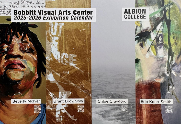
Beverly McIver On View
Bobbitt Visual Arts Center | Albion College August 30, 2025 Beverly McIver Munro Gallery | Bobbitt Visual Arts Center | Albion College August 30 - September 27, 2025 Reception: 5-7pm... Read more -
From Miami to Manhattan: Must-See Exhibitions, Galleries, and Events at Armory Week 2025 Aug 28
Miami Living August 28, 2025 As art lovers from Miami and beyond head north to New York for one of the biggest moments in the... Read more -
ABSTRACT EXPRESSIONISTS: THE WOMEN
Female Artists of the Mougins Museum & American Federation of Arts August 23, 2025 FAMM (Female Artists of the Mougins Museum), the only private museum in the world outside the United States with a... Read more -
'Abstract art is universal': Nanette Carter on her new career survey at the Wexner Center for the Arts
The Art Newspaper August 8, 2025 The artist speaks about what drives her practice in anticipation of a solo exhibition in her hometown of Columbus, Ohio,... Read more


-
Eric Dever: To see through the garden | ISSUE 67 — SUMMER 2025
Antennae | Journal ISSUE 67 — SUMMER 2025 Rooted in personal experience and ecological observation, this reflection traces the evolving relationship between painting and gardening in the artist’s... Read more -
Charlotte Park and James Brooks: Of This Place
Leiber Collection August 2, 2025 Charlotte Park and James Brooks: Of This Place August 2 to October 5, 2025 Opening Celebration: Saturday, August 2, from... Read more -
Chelsea Exhibition Reviews: New York Society of Women Artists, Berry Campbell, Rosebud Contemporary and GoCA
Whitehot Magazine August 1, 2025 From my perspective, a great on-site introduction to an artist comes when stepping into a solo show that really sweeps... Read more -
Interview | Nanette Carter by Matthew Deleget: Finding the tools and materials.
BOMB July 30, 2025 In the summer of 2019, my family and I moved to South Orange, New Jersey, after twenty-five years of living... Read more


-
Nanette Carter On View | Material Girl
Athens Cultural Center July 20, 2025 Athen Cultural Center On View June 6 - July 20, 2025 Gallery Hours: Saturdays & Sundays 12-5pm First Friday Reception... Read more -
ADAA Chelsea Gallery Walk & Artist-Led Exhibition Tour
Art Dealers Association of America July 16, 2025 Wednesday, July 16, 2025, 6 - 8 pm 524 W 26th Street, New York Please join us Wednesday, July 16th... Read more -
The Artsy Edit | Rising stars, overlooked greats, and Foundations 2025
Artsy July 16, 2025 Hi and welcome back to The Artsy Edit, a quick guide to what’s happening in the art world this week.... Read more -
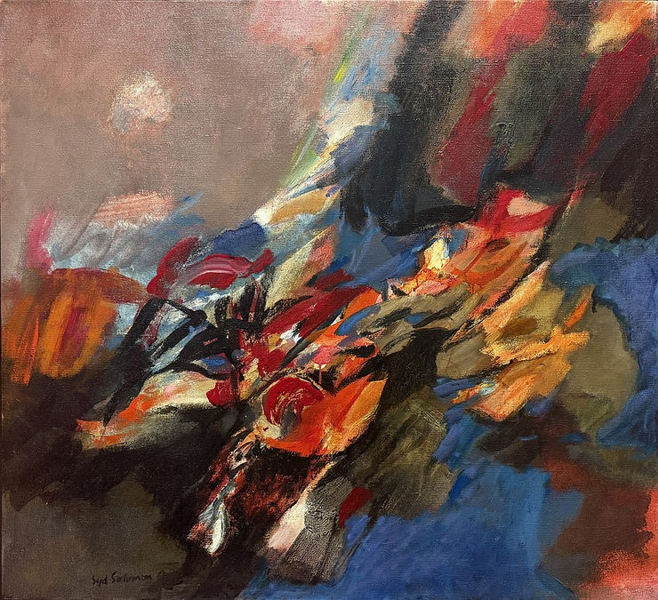
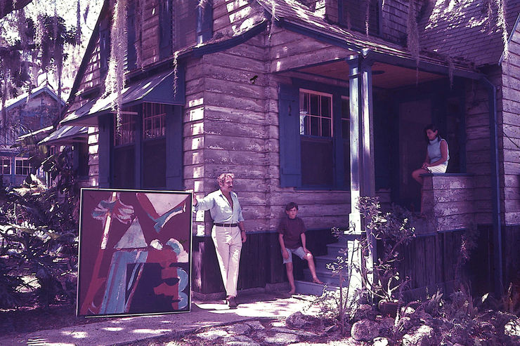
Decades Ago, Painter Syd Solomon’s Phillippi Creek Home Became a Magical Gathering Spot for an Endless Stream of Famous Artists
Sarasota Magazine July 10, 2025 Imagine growing up along the shores of Sarasota’s Phillippi Creek , back in the more bucolic 1950s and ’60s, in... Read more


-
Rescatan la figura de Lucia Wilcox, la artista que introdujo el surrealismo en EEUU
El Grito | El Confidencial July 10, 2025 Afincada en Nueva York tras la amenaza y los ecos de guerra en Europa, la artista introdujo el movimiento surrealista... Read more -
Eric Dever returns with a new botanical series on view in New York
The Flora Journal July 3, 2025 Berry Campbell Gallery , located in Chelsea, New York, USA, presents Eric Dever: Points of Interest , an inspiring new... Read more -
Event | In Conversation with Nanette Carter
Montclair Art Museum June 25, 2025 In Conversation with Nanette Carter June 25, 2025 7:00 pm - 8:00 pm Join Ben Jones and artist Nanette Carter... Read more -
Mary Ann Unger | Bodies, by Women
Sheldon Museum of Art | University of Nebraska June 24, 2025 Mary Ann Unger’s 1991 piece ‘Spine’ is on view now in: “Bodies, by Women” an exhibition in the Philip Johnson... Read more


-
She Brought Surrealism to America—and Painted Her Own Myth. How Was She Forgotten by History?
Artnet June 20, 2025 Lucia Wilcox rubbed shoulders with Surrealists in Paris, reinvented herself in New York, and created fantastical scenes of jubilant women.... Read more -
Beverly McIver | Exhibition | Kinetic Traces
National Academy of Design June 12, 2025 Kinetic Traces Location: National Academy of Design, 519 W 26th St, Floor Two New York, NY 10001 Date: June 12,... Read more -
2025 CPAL Annual Conference
Center for the Preservation of Artists' Legacies June 4, 2025 2025 CPAL Conference June 2 – June 4, 2025 Location - The Milton Resnick and Pat Passlof Foundation 87 Eldridge... Read more -
Artfully Investing: An Art Market Update and Private Planning Discussion
HSBC Event June 4, 2025 HSBC Private Banking Hosts “Artfully Investing: An Art Market Update and Private Planning Discussion” at the renowned Berry Campbell Gallery... Read more


Page
1
of 3