Hedonism Triumphant | Jill Nathanson at Berry Campbell Gallery
June 1, 2015 - Piri Halasz for (An Appropriate Distance) FROM THE MAYOR'S DOORSTEP
Just as the death of Broadway has been predicted since movies first talked, so too reports of the death of painting have been greatly exaggerated. Not least its survival is due to artists like Jill Nathanson, whose current show at Berry Campbell combines traditional approaches with new technologies to create paintings that could only have been made in the 21st century.
“Jill Nathanson: Fluid Measure” (through June 27) is perhaps controversial in another way: it features 16 abstract paintings whose gossamer floating shapes and palely lovely colors might be called “hedonist” by those overly-conscientious critics who may feel either guilty or embarrassed about praising paintings whose sole purpose is to give pleasure by looking marvelous, and whose creator hasn’t chosen to present art that’s useful or conveys messages.
I first met Nathanson in 1984, at the opening of her solo exhibition at Clayworks in Greenwich Village. This now-defunct gallery was affiliated with the Triangle Artists’ Workshop and run by Ann & James Walsh. It was the first show Nathanson had held in a Manhattan gallery not affiliated with an educational institution she was attending (although she had previously had a show at Hunter College, where she had earned an MFA in 1982 after graduating from Bennington).
In 1984, Nathanson was based in the Boston area. It was then a mecca for talented younger abstract painters, thanks in large measure to the encouragement and support they were receiving from Dr. Kenworth Moffett, longtime curator of 20th century and/or contemporary art at the Museum of Fine Arts, Boston. After Moffett stepped down, at about that same time, a number of these younger artists also shifted their focus.
Nathanson was one of those who relocated to New York, with successive studios on the Lower East Side, New Jersey and (I think maybe) also elsewhere. I saw a bit of her during this period, and remember a phone conversation in which she told me that she had a grandmother who lived in the Bronx “I didn’t know you had a grandmother in the Bronx,” I said. “Of course,” she said (to the best of my recollection). “Doesn’t everybody?”
Since that time, she has married a doctor and raised a couple of children. According to her website, she’s on the board of Triangle, teaches at the New York Studio School, and has been the subject of an enviable string of articles and reviews, including two by Valentin Tatransky, three by Mario Naves of the New York Observer, and seven by Karen Wilkin.
Though I’ve run into Nathanson at many art-world gatherings, my main source of information about her in recent years has been her exhibitions, of which I’ve reviewed three in the past five years alone—not altogether favorably, but definitely respectfully. I’ve always regarded her as a serious artist, but faulted the paintings in her 2010 and 2012 gallery appearances in Chelsea for lack of adventurousness. While I admired the spontaneity and freshness of two of the big collages in her 2010 exhibition in the Derfner Judaica Museum at the Hebrew Home in Riverdale, I was also forced to comment on their somewhat amateurish appearance.
In her current show, I’m happy to report, Nathanson seems to have brought spontaneity, freshness and professionalism together into a most impressive mix. Part of my ability to respond more favorably to it must be due to the fact that it consists primarily of larger and more ambitious paintings, not as large as the collages in the show at the Hebrew Home, but bigger than I can recall seeing in either of those last two gallery exhibitions.
Another part of my response may be due to the fact that when I stopped by to see the show, I found the artist present. We got into a conversation about her materials and techniques that better enabled me to appreciate the uniqueness of her approach.
The press release for the gallery implies that Nathanson learned about color at Bennington from Kenneth Noland & Larry Poons. As far as I know, Poons has never taught there; although Noland had a house near there in the 1960s, and taught there for one semester, he had moved back to New York before Nathanson arrived. While she may have learned from both of them about color elsewhere, in a more informal context, her compositions, which are composed of groups of smaller, freer shapes, couldn’t be further from Noland’s rigid geometries or Poons’s all-overness and dots.
To me, these compositions of Nathanson’s, with their smaller, freer shapes, have far more to do with paintings from the 60s by Helen Frankenthaler (though many other painters during this period were also using smaller, freer shapes, men as well as women). At the same time, Nathanson’s paintings differ radically in that the shapes in the paintings of all these earlier artists abut upon one another, and are generally bounded by either straight or rounded edges (depending upon which individual painting is under consideration).
Nathanson’s shapes, by contrast, are bounded by edges that are sometimes straight, sometimes jagged, and occasionally rounded – all within the same picture. They look like pieces of paper that have been cut or torn, nor is this by chance. Rather, it’s because they’re based upon collages that constituted the preliminary studies or modelli upon which the paintings are based.
Each painting in the show went through at least three stages. First came the modello, made from cut or torn pieces of what are known in theatrical circles as “gels.” Gels are paper-thin transparent colored sheets of polycarbonate or polyester that project color when placed in front of lighting fixtures or windows. They are used, for example, in theaters to create colored spotlights, and are sold through theatrical lighting suppliers.
The second stage was to translate this modello into a smaller painting, which then became the basis for the larger, final one. As the original collage was made from transparent gels, its composition could incorporate some or even all shapes that, instead of being placed next to each other, overlapped. This meant that the shapes underneath remained visible and altered the color of some of the superimposed shapes.
All very well, you say, but what’s new about that? Making smaller, preliminary modelli goes right back through the ages, probably to the 14th century in Europe (though the 17th century modelli made by the Italian baroque sculptor Gian Lorenzo Bernini are particularly prized).. This technique is also as new as the late 20th century painter, Friedel Dzubas, whose exhibition at Loretta Howard in March featured a whole wall of delightful small preliminary modelli.
The difference here is that Nathanson’s modelli were made from transparent gels, and until very recently, no paints appear to have been made that would convey the same impression of transparency on a panel or canvas. Enter here those masterly paint manufacturers, Golden Artist Colors of New Berlin NY, who since 1980 have been creating a vast range of paints and other artist supplies which have enabled painters of every variety to achieve new and ever more wonderful effects.
From Golden Artist Colors, Nathanson has been obtaining not only oils and acrylics to create her paintings, but also a paint that the checklist at the gallery calls “polymer,” and that is mostly responsible for the elegant, fluid transparency which so distinguishes these paintings.
I wanted to use the brand name that corresponded to this miraculous “polymer,” so I looked at the Golden website. As I couldn’t find anything there that looked right, I called and learned that Nathanson uses “various pouring mediums” from the “custom lab” at Golden, where they prepare materials for individual customers. Such paints aren’t listed at the website nor are they available commercially. The pouring mediums that Nathanson employs have only been available since around 2010.
There you have it: the 21st century technology that makes possible the advanced pictures which Nathanson arrives at. Consulting my reviews of her last two shows (in 2010 and 2012), I find that she was already using these polymers then, but in the intervening period, she has learned to handle them far more effectively. At present, she relies upon her preliminary studies only up to a point, but sometimes edits unnecessary details out of them for the final version and/or experiments with freely-flowing, more accidental pourings.
For me, the best paintings in “Jill Nathanson: Fluid Measure,” are, on the whole, the larger and simpler ones, those which incorporate only a limited number of colors. The most complex and ambitious of these larger ones is “In Fluence” (2014). Situated in the front space of the gallery, it has cloudy sky blues in the upper left part of the canvas, deep red sweeping on the lower left, tans in various shapes in the upper right, and greens on the lower right with touches of cream.
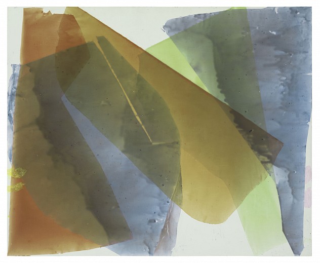
“Brass Instrument’ (2015), which hangs in the gallery’s central space, is quite powerful and looks good on the exhibition invite. In my discussion with the artist, she emphasized how she likes to get a dialog going between different corners or sides of a painting, but in this case, I was more aware of its delicate, gauzy central element – a broad, vertical and freely formed rectangle, with overlapping, transparent areas within it of tan, mustard and pale lime.
Best of all is “Influence Green” (2014), though it hangs in the back space of the gallery. It works best because the degree of saturation is most even: every element is equally luminous and bright. And it’s a grandly simple, truly classic composition with only two major components. On the upper left are two broad, diagonal light browns, slicing down diagonally and superimposed upon upstanding verticals of light blues and green. Small top and bottom areas are covered with thick white acrylic, no color at all here to distract the eye from the magnificence of the picture’s luminous centrality.
Back to News