Whitehot Magazine: Jill Nathanson: Light Phrase at Berry Campebll
February 9, 2021 - Cori Hutchinson for Whitehot Magazine
Jill Nathanson, a lifelong advocate of Color Field abstraction, wields a bright turn of phrase in her third Berry Campbell exhibition, expressing important feelings about color, proximity, and concord. Noticing the disruption of my fingers, an additional element, through Nathanson’s painting thumbnails on a checklist printed on thin paper was enough to convince me of the sheer power of the work exhibited here in which all layers on flat wooden panels sum to a fully multi-dimensional space. The acoustic quality of the paintings, hinted at by select titles (Harp, Chordzephyr, Woodwind), is heard as a result of this spatial illusion. The painter’s biographical information, and particularly her upbringing in a musical household, furthers this reading of her work.
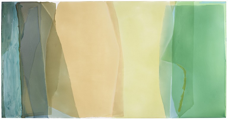
The paintings reach deep rhythms and rich harmonies with their expansive palettes and chiffon likeness. In Only a Friend, Nathanson mixes a platonic ideal of bleached apricot and buttery daffodil shades in the center with flanks of bubbly gray-blue and still sea-glass. If briefly considered a landscape, the viewer is unable to differentiate between window and curtains, resulting in pleasing surface tension, each edge becoming a true crevice rather than a point of delineation. An oily olive ribbon to the right, likely applied post-pour, suggests a moment of organic activity, such as the drag of a wave onto coast.
Nathanson’s implemented notion of “color desire” similarly tugs on the viewer as one’s gaze travels across each work; the painter is uniquely aware of the somatic effects of art and its relationship to pulse. Flexing works such as Light Wrestle provoke a push-and-pull response. This active relationship with the panels is determined by the immaterial energy itself of each field, as well as the muscle required by the artist to physically handle and manipulate the materials.
The depth created is also, in part, due to the predetermined clarity of color. Hardly ever in these paintings is there muddying despite the elaborate entanglement and overlap. Nathanson’s distinct style of color mixing yields results such as in Sparkshift, where an overlay of Baldwin apple red and powder blue does not produce purple, but instead each color remains true to itself, fulfilling the tall order of being two things at once. This technique recalls Walter Benjamin’s fragment “A Child’s View of Color,” translated by Rodney Livingstone, wherein he writes, “Color is single, not as a lifeless thing and a rigid individuality but as a winged creature that flits from one form to the next.” What is the putty pink on the right side of the panel if not a pure mood? Color in Nathanson’s work, animate, playful, pure, is described well by this Benjamin text.
One of several paintings whose phrase-titles fall within the realm of magic is Elixir, which blends something like a magnetic binary composition with one blue tail crossing the center near the bottom. A potion of improbability and convergence, symmetry despite asymmetry, the planes in this painting stretch beyond the viewer’s belief. rising to an exercise in spirit.
As a series, these works play with doubling. Trickster color combinations improbably defy form similarity among like-forms. Elixir and Sway Chorus, Light Wrestle and Sparkshift, & Going Goya and Harp are among these form-doubles. Unexpectedly, the expert color manipulation by the artist increases visible relationality between palettes rather than forms, forcing kinship between, for example, the cool palettes of Only a Friend and Getting Light.
Getting Light is more reminiscent of earlier Nathanson works such as those shown at MOCA Jacksonville in 2016: kaleidoscopic, radial, and gathered in a single, sometimes centered, origin point. The language of graphs is handily applied to this work as each panel undulates and crests according to its respective lightwaves. Tan Transpose, citrusy and dappled, mathematical in title and form, shades in the gaps between two plotted lines on a Y-axis. The “sine” curves here, and in many of the compositions shown, distinguish this series, mapping a rate of color and, ultimately, gaining momentum.
In one interview, Nathanson refers to her practice as “pseudo-spontaneous,” as she realizes and tapes off the shape of each color before it is poured, then waits a full day for each color to dry. The gradual and rewarding viewing experience of the paintings is owed to this process, sloping and seeping at its own willful, radiant pace. WM
Back to News