ART REVIEW: Jill Nathanson Explores Deep Commitment to Color Interaction
June 18, 2018 - Peter Malone for Hamptons Art Hub
As the exhibition title “Cadence” implies, there is a cyclical pattern to Jill Nathanson’s paintings. In the artist’s current show at Berry Campbell in Chelsea—consisting of a dozen or so pieces remaining on view through June 30—each painting returns to a fundamental premise. All of the works rely in part on an easily grasped compositional process to create subtle color relationships that in turn complicate what seems at first a predictable formula.
As with the analysis of any abstract painter’s work, it is essential to get beyond a recognition of the look a painter has created—the visual idiosyncrasies that render an artist’s work immediately identifiable—and delve deeper into the concerns to which an artist confesses by their methods. This process appears to be particularly relevant for Nathanson, whose compositional structure begins the same way but drifts in a variety of directions; the artist seems distracted, so to speak, by an essential commitment to color interaction. It is color alone that seems to animate the painter’s wrestling with her method.
Her working method looks relatively uncomplicated, as its limited number of final steps are what a viewer encounters in the finished work. But as described in the accompanying text Berry Campbell, the process is more soufflé than casserole. Delicate maneuvers dominate the first stages, followed by bold pouring refined afterwards with subtle additions of opaque color. The suggested cadence, a motif that circles back onto itself, is evident both in the repetitive character of each composition and in how colors fold in on each other.
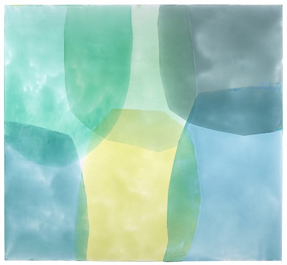
Completed with five or six overlapping translucent shapes created by pouring a prepared color along a line that has been drawn and masked, each painting reiterates a basic compositional pattern. Large areas of color, poured between a predetermined line and that part of the frame’s edge delineated by the line’s endpoints, fill the entire frame in a collage-like translucent screen.
With few exceptions, Nathanson’s work presents the viewer with the feeling that a space has been partially and methodically covered up. Layers of color interlock like the aperture blades in a camera. It is a useful simile, but has its limits, for unlike the mechanically devised aperture, Nathanson’s overlapping shapes are quite irregular and the open space they leave can be almost anywhere in the painting. Some, like Timbre, 2018, imply an underlying grid, whereas most of the works here have the freeform feeling of Time Signature, 2018.
Nathanson’s color is surprisingly muted, counterintuitively so, even after taking note of it. With the evidence there before the viewer, it still seems strange that the yellow in the upper left corner of Key Transpose, 2018 is not an opaque cadmium, for it has an uncommon luminosity that it shares with all her work. Each color’s intensity is a function of its translucency and its proximity to other darker, yet equally translucent hues.
Nathanson controls color not by blending so much as by adjusting the ratio of a pigment to medium and to the white ground beneath. To find an acrylic medium that performed to the standards she set for herself, she collaborated with the people at Golden, apparently through a program they offer artists when that artist’s needs are not met sufficiently by the company’s over-the-counter products. The care and fuss the artist has expended on arriving at a working consistency for her painting medium pays off. The pigments’ brilliance is like stained glass, while their understated intensity brings a sense of serenity.
Once the layers have been poured and dried, the artist examines the results and at times makes assertive changes by adding small sections of brushed oil paint. Regardless of meticulous planning and her understated exploitation of serendipitous textures, these touches of color reveal a commitment to an optical vision, not a strict minimalist process.
A panel called Empical Empyrean, 2017 reveals several strokes of ochre running along the edge of a pale blue curved shard of color. Against the same curve, there is another series of strokes, this time forming a curve aligned with the painting’s vertical divider in an opaque mixture of the pale purple that dominates the lower left area of the painting. A third series of strokes in a dark green oil paint accentuates one edge of a green shape near the top center.
Together these brush strokes retain the general feeling of the composition, following cues already in place from the poured sections. They tend to respect the fixed outlines of a panel’s shapes, which indicates that Nathanson’s sense of balance between color and form is the key to the work, clearly aligning her with the color field painters of the 1960s.
Yet Nathanson has cut a new path, meandering between the extremes of spontaneity, as in the work of Helen Frankenthaler, and the near proprietary claims to specific shapes that identify classic Kenneth Noland. What she shares equally with these artists is a connection to color that is distinctive, personal and, in her case, uniquely associated with light.
____________________________
BASIC FACTS: “Jill Nathanson: Cadence” is on view May 24 through June 30, 2018 at Berry Campbell Gallery, 530 West 24th Street, New York, NY 10011. www.berrycampbell.com
A gallery talk at Berry Campbell at 6:30 p.m. on Thursday, June 28, 2018 will feature Jill Nathanson in conversation with A.V. Ryan.
Back to News