Eric Dever on Canvas
August 8, 2016 - Mary Demaio for Long Island Post
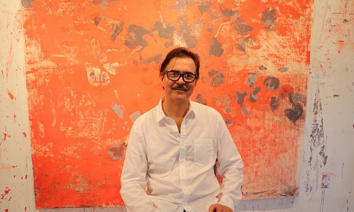
Eric Dever’s work is black and white and red all over. He began using the limited color palette 10 years ago this month as a way to create subjective designs that echo hues from the environment. Before summer ends, people can experience his work at exhibits in New York City and the Hamptons. I caught up with Dever at his studio in Water Mill to find out more about his upcoming projects, what inspires his creativity and the meaning behind his abstractions.
How would you describe the artworks you have on display right now to someone you’ve never met?
I created an array of paintings that went from translucent to opaque. I chose to work with [black, white and red] because of my interest in the material properties of paint when applied to canvas, linen and burlap. On canvas, the paint or color appears brighter, as well as the space between strokes. The linen and burlap I work with is coarser and so the warp and weft of the material is often visible, which also holds the paint well. Sometimes the color of the visible linen becomes a compositional element, which also informs the adjacent color. They are all geometric abstractions. I wanted to get the color to respond to the application itself by using different shades and scales based on the smoothness or roughness of the canvas, linen and burlap.
What does your limited color pattern represent?
The colors represent qualities that bind all of existence. Black represents weight and matter, red represents energy and white represents lightness. They also correspond with dark inertia, passion and clarity, which reflect one of the themes in my work. The anther of the rose that carries the pollen became a motif in my paintings. The dynamic color elements seemed to represent the creative potential of each flower. There is an organic quality in them that mirrors the life in a garden.
The Hamptons is full of gardens and other beautiful, natural settings. What, if anything, about the area inspires your work?
I think being surrounded by all of the water and the four seasons definitely impacts my paintings. I take shades from the environment like the sky and certain weather conditions. I started to mix all of the colors together and was able to find a shade that was purple or a little lavender to illustrate those different atmospheres. Reconnecting with the environment or the sea is unavoidable out here. The roses in my garden are going to take in the spring and I think about that when everything is frozen and the ice is piled up. Spring is really our turn for renewal in the years going forward.
Where can we see your artwork?
I have work in a group exhibit at Berry Campbell in Chelsea NYC. It just opened in July. Also, Guild Hall Museum in East Hampton and Grey Gallery/NYU Art Collection (that’s where I went to school and I loved it).
What makes your exhibits meaningful to visit? What do you want people to walk away with?
I don’t have a prescribed plan for the viewership, but if my work could make them pause and think more deeply about their own experiences I would be very happy. I do title my work like NISBW59 (Napthol Scarlet Ivory Black Titanium White 59th painting with this combination of colors). I do it purposely, just mentioning the paint I used in the acronym in order to give the project continuity and to not interfere with the viewer’s perception.
Back to News