Bravo, Bannard: A Major Show in Chelsea
March 4, 2014 - Piri Halasz
Walter Darby Bannard is a hedonist, and proud of it. He believes that the role of art is to give pleasure. It’s not meant to be an intellectual exercise, or political propaganda, or even an illustration of something that it’s not (though he has plenty of room in his lexicon for representational painters, past and present, whose work pleasures the eye, regardless of what else it may or may not do).
This is not to say that Bannard doesn’t understand the importance of the written word. Over the years, he has written much and often eloquently, but as he sees it, the written word belongs in books, letters, magazines, and even on the web, as opposed to on the walls of galleries, offered as art.
In this, he furnishes a striking contrast with Loren Munk, who is also known as James Kalm when he writes (I first met him a decade or so ago, when we were both writing for NY Arts). As an artist, Munk is a passionate practitioner of paintings that are almost all about writing. His trademark is complicated diagrams and maps densely labeled with names of many artists and other members of the art world.
I mention Munk/Kalm because at the moment he has a show entitled “You Are Here” at Freight + Volume, the gallery which shares an entry on West 24th Street with Berry Campbell. And Berry Campbell, the modestly-scaled but very ambitious gallery that only opened this past fall, is currently displaying “Walter Darby Bannard: Dragon Water.”
On its walls hang thirteen small to largish (but not really large) abstract paintings by Bannard, all done between 1976 and 1979—and not even graced with the lettering of the artist’s name.(both shows through March 15).
I am prepared to give the Munk show a “mildly interesting,” if only because it includes a painting centering on Clement Greenbergk’s is relatively clever. But when it comes to art that gets me in the gut, there is just no comparison. Bannard’s paintings can do this; Monk’s do not.
I don’t know how Bannard’s paintings will strike other viewers. I consider most of them stunning. There were only three that I couldn’t in good conscience give at least two stars to, six that I gave three stars to, and one that even rated a four.
To be sure, I’m one of those card-carrying Greenbergers who responds to subtlety of color, close-valued rose colors and golds and mauves and blues and many greens and the other sophisticated tints in the paintings in this show.
I don’t feel a need to have the bright and usually (though not always) simplistic palettes that I seem to have seen so much of in galleries recently—color schemes that appeal even to those whose ability to appreciate offbeat color may have atrophied over the years from their lack of exposure to quality color.
Another pleasure in these Bannards (for me, but maybe not for everybody) is their voluptuous facture. Their surfaces ripple with raised surfaces and wiggling, wave-like forms, or else the paint is caked and crusted on, like the beds of dry rivers or aerial views of cooled highland lava.
All of this abundance of facture, I believe, was achieved by the combination of many different pigments with gel. So, too, I think, must be the succulent liquidity of the shiny finishes, which offer such a welcome relief from the flat, dry facture of so much (though certainly not all) contemporary abstraction.
Admittedly, these paintings belong to a school rather out of the limelight at present (Greenberg used to say that the best work has always been out of limelight). Anybody who knows this school at all will see kinships between Bannard’s work and that of Jules Olitski, Larry Poons & Helen Frankenthaler during this period--but anybody who can’t distinguish between Bannard’s work and theirs doesn’t know the school very well: this artist’s work is equally unique—his color sense not least of all.
Typically, one color (or set of colors) dominates, with large areas covered by it, while much narrower, raised and curved lines, scrapes & sweeps & squiggles appear in contrasting colors. In describing these works, it’s easiest to call the large areas “the field” but actually, it looks to me as though in many, maybe most, cases, the lines, sweeps and squiggles were laid onto the canvas before this “field” was applied, and peer through it, lightly tinted by it.
Which paintings did I go for most? Starting at the back of the gallery, and working toward the front, my eye was first seized by “Moss Landing” (1978). A vertical with a field of yellow and orange, it’s embellished with lavender blips, and a diagonal feeling, the action rising from left to right.
Another painting in the back gallery is “Down Down” (1979). A horizontal, it struck me at first as cheerful but jocular. Also, though the field is orange, it gave the feeling of being an underwater scene, probably because across the top is a foamy band of a lighter orange that reminded me of foam at the top of a wave. A couple of inverted dark red arcs on the lower left could conceivably equate to some kind of sea life, but later on, when I revisited it, the analogies faded away and I was much more favorably impressed.
Moving on up to the middle gallery, two paintings here stood out for me: “Pakistani” (1978) and “Cummin Strand (1978). The former, a horizontal, combines three very restrained colors (light orange, light yellow and mauve) in shapes like ribbons or folded curtains (yet not quite like them, either).
The latter, a vertical, has a rollicking feeling, and reminded me that this whole show is a cheerful, happy-making show (for me anyway—and I like to think that the artist had as good a time making these paintings). The colors are lovely here, with thickly caked and crusted rusty orange paint, surrounded by a range of greens – mint on the top, chartreuse on the lower left and grass green spread liberally around.
The cream of the show is in the front or reception area, with three magnificent paintings. Looking from right to left, one sees first “Summer Drawn” (1976). Its field is a shiny lime, with bluish vertical blips liberally distributed from top to bottom, and lots of tiny bubbles ornamenting the lime.
Directly in front of the entrance from the street, and behind the initial reception desk, is a commanding vertical, hung on high. It’s “Calico Bend” (1976), and its broad areas of vertically scraped-on color combine red and green, with neither dominating (this is the painting that appears on the invitation). Its green and red coloration are less distinctive than the colors in most of the other paintings in this show, but the fact that it’s a vertical drives out any landscape associations and lends it majesty.
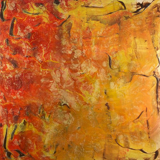
Finally, my four-star painting, “Dragon Water” (1977), for which the show is named, hangs on the wall to the left of the street entrance. A’ large square of 65 x 65 inches, it joyously combines caked & crusted orange paint, fading into gold, with very free, little, worm-like, purplish brown squiggles, mostly around the periphery. As with so many equally amazing paintings by Hofmann & Olitski, I get a sense of aerial photography here—nature seen from on high.
Back to News