ART REVIEW: Charlotte Park Paintings Shine Light on Major AB-EX Talent
February 29, 2016 - Charles A. Riley II for Hamptons Art Hub
Redemption can be jubilant, as the current resonant solo show devoted to Charlotte Park (1918-2010) at Berry Campbell gallery in Chelsea proves. After decades in the shadow of her husband, James Brooks, Park steps forward from the Abstract Expressionist chorus and unleashes her singular strong voice, hitting all the top notes of color, gesture and scale with confident power.
Born in Concord, Massachusetts, Charlotte Park graduated from the Yale School of Art in 1939. During World War II, she met Brooks while she was in Washington, D.C. working for the Office of Strategic Services. They moved to Manhattan in 1945, renting the front space of Jackson Pollock’s studio at 46 East 8th Street and joining “The Club” that included Pollock, Lee Krasner, Franz Kline, Willem de Kooning and the titans of the era.
In 1949 they followed the rambunctious crowd (although many recall them as being the sober and demure couple amid the heavy drinkers) to the East End of Long Island. On a cliff at Fort Pond, not far from the Navy dock at Montauk, they found a ramshackle fisherman’s house with a shed they turned into their shared studio. On August 31, 1954, Hurricane Carol blew the shed right off the cliff down onto the beach and all the work as well their books and supplies were lost.
The door and some other parts of the shed were salvaged by friends, who took the pieces to Springs to build a new studio in the woods on Neck Path, now abandoned. Today there is a movement afoot to restore it as a museum, like the Pollock-Krasner House and Study Center, under the name Brooks-Park Heritage Project.
Park and Brooks were a popular artist couple in the Hamptons in the 1950s. In their adjoining studios in Springs, they painted works that were sometimes similar, especially in black and white.
Park was respected in her time by fellow artists and curators, who included her work in the Whitney annual of 1953. She showed regularly in that era at the Stable gallery, then abruptly dropped out of the gallery scene in the 1960s. Her deference delayed recognition, which has come belatedly from such quarters as the Parrish Art Museum and the Pollock-Krasner House, where Director Helen Harrison held an intimate exhibition of her work in 2013.
Recent critical acclaim has come from Roberta Smith of The New York Times (reviewing a 2010 show, she called her “a natural painter and a gifted colorist”) and Robert Pincus-Witten, who wrote in Art Forum: “Hers was a major gift all but stifled by a happily embraced domesticity and by the critical bullying of a brutally doctrinaire art world.”
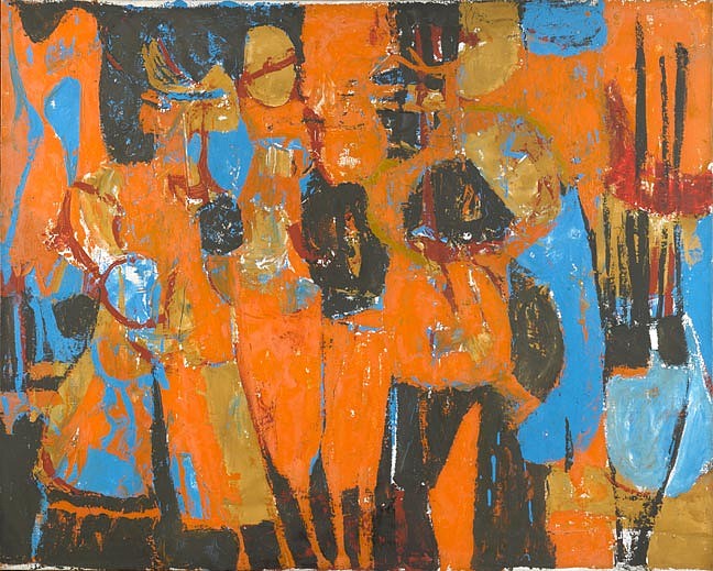
Pincus-Witten’s use of the word “major” seems entirely appropriate, and I have no hesitation in applying it to Jubilee (1955), the most muscular, tactile work in the Berry Campbell show. The dominant color is the orange of an established wood fire, which spreads from edge to edge out of a funnel form at the bottom of the canvas. The orange is spread thickly over undertones from umber to green, bounded by ragged edges of black that loop and rebound, as they do in many of Park’s black and white paintings of the period.
Charlotte Park's use of the matte black shows an avowed debt to Goya, and it takes nothing away from the brio of her work to note that it weighs in alongside similar implementations by Kline, de Kooning, Fritz Bultman and even her husband, James Brooks. The black here also reminded me of the way Georges Rouault bounded the deep tonal areas of his paintings in a black line that is like the leading of a stained glass window.
The painting demands close inspection as the surface of Jubilee is a completely hectic gathering of gestures and textures crossing and interrupting one another. As easy as it might be to say that the orange is the major key, the work is unified by the flicker of blue in each corner and throughout the undercoating, slipping to the surface often enough to answer itself across the expanses of orange.
The swift black gestures take on a masterful bravura in Untitled (Black and White) (c.1950) as well as #25 (1951), two of the small black and white works of the 1950s, where the marks are as substantial as the Chinese “bone” style of calligraphy and its ti (“rising”) and zhe (“turning”) strokes.
The most eccentric work in the show, to my eyes, is aptly titled Departure (c. 1955), which may be modest in size but amplifies its gestural and graphic presence by setting two bright complementaries against one another—a marine blue that is different (more industrial) than her usual range of blues and an orange that also seems less artsy, more cautionary. The procession of vertical lozenges, as well as the paler blue, is reminiscent of the Spanish Elegy series of Robert Motherwell.
The exhibition is rounded out by selections from the ensuing decades, during which Park’s work passed through considerable metamorphoses in step with the times. The most important change is the abandonment of that black armature that in the ’50s had defined her white interiors. The abandonment of the black makes way for the veiling of surface and underpainting with the more and more prevalent white, which softens the statements.
The grand, incandescent fanfare in golds, reds and pastel blues that greets visitors at the door, Untitled (c. 1963), is utterly without black. As radiant as the Fauve abstraction of her Hamptons neighbor and friend Giorgio Cavallon, its high golden sun burns hotter for the white nimbus that surrounds it.
Park and Conrad Marca-Relli were also friends, and his way of blending paint and collage (recently reviewed on HamptonsArtHub.com) is strikingly similar to Park’s Untitled (Color Collage II) (c. 1957), which flows wonderfully across the cut edges of the gouache on paper, divided between puffs of white and blasts of ruby. I nearly missed a shard of red piercing the black in the lower left hand corner, one of the most dramatic moments in the work.
The paintings are imbued with Park’s close connection to the garden and beach, shore birds and perennials whose appearances are recorded in copious notes that ought to be carefully archived. Filtered through the iconography and colors of the paintings, leaf forms and flashes of plumage flicker in the brushwork.
The sourwood or sorrel tree lends its Latin name to Oxydendrum (1975), one of the light-filled, Mondrianesque small square acrylic and oil crayon works on canvas that reflect a vastly different aesthetic, shaped by encounters with Minimalism. Before chalking up another victory to rectilinear patterning, though, note the looping, ovoid and leaf shapes on the left side balanced on a column of blue.
The most plangent piece in the show is a little square acrylic called Tuolomne (1981), after a river in central California. Across its cotton white surface float ribbons of green, red, blue and yellow. An errant green line wanders toward the left edge, like a sentence that trails away incomplete. It hurts and helps to know that Park was living with Alzheimer’s at the time. The group of similarly bright, open paintings share many characteristics with the emptied late works of de Kooning.
Today, Park’s work has taken its rightful place in the collections of the National Gallery in Washington, New York’s Whitney Museum and, in The Hamptons at both Guild Hall in East Hampton and the Parrish Art Museum in Water Mill. The strength of “Charlotte Park” at Berry Campbell makes it clear that the public collection most conspicuously missing from the list is New York’s Museum of Modern Art.
Back to News